
On this page
- Overview
- What I did
- Case study: Browse and research
Overview
As the Lead UX Designer for dyson.com, I took on the role when the website was three months past its launch and in the early stages of being rolled out to other countries. Being a keystone of the company's digital transformation, the website required a lot of attention.
What I did
At that time, the UX team was primarily focused on wireframe designs, and there was no budget or capability for user research. Additionally, there was a separate team of UI designers who were interested in conducting their own research but needed more support and confidence.
Managed a team
I was brought in to manage a team of five, implement UX strategy and process, as well as advocate UX research value across the business.
I was also asked to mentor ten UI designers to become more confident in running tactical user research.
Won operational budget
Successfully secured an operating budget by building trust with the business and delivering tangible results.
We introduced tools and lean process for UX and UI designers to be able to self serve on tactical research such as: Usability Hub, Optimal Workshop, and Survey Monkey.
Empowered designers
We trained UX and UI designers to conduct tactical research on a regular basis, emphasising that UX is everyone's responsibility.
I empowered designers to conduct unbranded guerrilla testing methods. Despite challenges in a secretive or confidential culture, this took a careful approach to protect industry secrets and calm confidentiality concerns.
We established UX research as a service for more in-depth studies and built relationships with user recruitment agencies.
We also implemented regular peer reviews and integrated UX into an agile framework.
Showed results
We worked on many data-driven improvements across the customer lifecycle, aimed at enhancing the customer experience and boosting business metrics.
We encouraged designers to learn and use Adobe Analytics and Adobe Target for A/B testing - tools that were previously underutilised.
We ran many experiments and studies to bring impactful results through incremental change and a build, measure, learn cycle.
Our team supported successful seasonal marketing campaigns like Black Friday and Christmas.
We worked on new product launches for Dyson's V5 Supersonic Hair Dryer, V10 Cordless Vacuum, Dyson Airwrap Multi-Styler, and more.
Case study: Product comparison
The problem
Customer feedback showed that research and purchase users were finding it challenging to compare Dyson vacuums, which have many variations and unintuitive naming conventions. They needed more detailed information to make a decision, and wanted to be able to compare products.
61% of users surveyed in a sample size of 715 responses reported that they didn't accomplish what they wanted to do, and their main issues were:
- Needing more product information
- Product information was confusing
- Couldn't find what they were looking for.
“So difficult to work out the difference between different products. No clear way to compare and all marketing speak, no info.”
– User, UK Digital Survey December 2017
“There appears to be no provision to enable potential customers to see a humidifiers' specifications (dimensions, weight, tank capacity, etc. etc.). If the information was there it was far from evident.”
– User, UK Digital Survey December 2017
"I couldn't compare products easily and not sure that I saw the full range of products."
– User, UK Digital Survey December 2017
Date Range of analysis 1-13th December 2017, over a total sample of 715 responses
User observation
Analytic data showed that visitors who spent more time on the website viewed multiple product pages and frequently returned (the research cohort) were likely to abandon their carts and have a lower conversion rate.
We used behavioural analytics to view heat maps and session recordings which allowed us to observe the problem and pinpoint areas of friction and confusion to explore further.
We found that research users would typically return to the "Choose your model" section, move back and forth with the carousel and expand the accordion for more info. They would then click through to various learn more pages and then drop off.
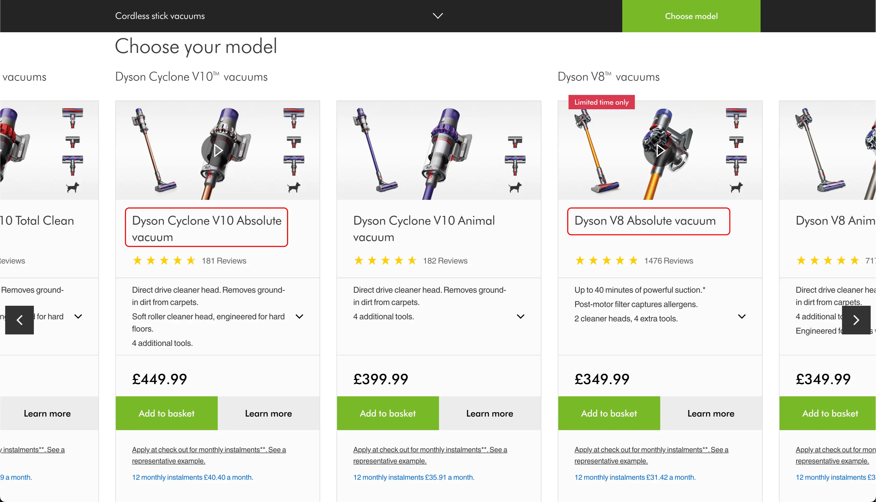
Although the "Choose your model" section is helpful for highlighting products that are complementary or similar, it doesn't present a detailed comparison of features, pricing, and specifications that users need to purchase such a high ticket price product.
The "Choose your model" section also doesn't highlight the leaps in technology between generations of vacuums, which we assumed made it hard for some customers to justify the cost of upgrading or buying the latest model.
A/B Testing
We designed and developed a simple mobile-first comparison table to A/B test using Adobe Target on Vacuum purchase journeys only. After two weeks, we saw a marked improvement in cart abandonment and purchase conversions for our browse and research cohort.
After the experiment concluded, we specified designs for developers to create an accessible and responsive, CMS-driven comparison table component that could be inserted into any journey and used across any product category to compare related products. We also conducted visual QA and end-to-end journey testing through to launch.
Key outcomes
6
months
design to launch
The app was researched, designed and developed within 6 months.
£
150
k
uplift in month 1
Contributed to over £150k uplift in B2B revenue within the first month of launch and massively saved on print material costs
8
countries
adopted the app
The app launched in the UK and then France, Germany, Spain, Italy, Australia, US and Canada.


-3.webp)
Testimonials
I had the pleasure of working with Joe Mallory Skinner on our high profile B2B app project. Joe was hired as a User Experience Designer and was briefed to design an intuitive app that would transform the way our field sales teams operate and consequentially lead to increased cost savings for the business.
Joe’s user centred approach and attention to detail was immediately noticed and admired. Working closely with users, Joe produced excellent and detailed designs that delighted users and stakeholders; ultimately providing a faultless model for the development team to work from.
Joe’s commitment to the project has continued throughout the app’s development, ensuring it adhered to our strong brand guidelines, whilst supporting our technical team with problem solving.
His dedication and talent has won him respect throughout the business here at Dyson and I would have no hesitation in recommending him for future projects.
